Sunday, May 1, 2011

My RaDAR Paper for SatRad GR6753

A RaDAR Analysis of the 2007 Groundhog Day Tornado Outbreak, Central Florida

 
Introduction

          In the early morning hours of 2 February, 2007, ground temperatures were already rising to levels well above average; coupled with massive amounts of moisture and a powerful mid-level jet stream overhead, synoptic conditions were favourable for severe weather.  The instability and wind shear led to a system of squall lines and supercells across Central Florida which would produce multiple tornadoes, killing 21 people and causing over $200 million in damage.  One of the most dangerous aspects of these storms is that they began at night locally.

          Following is a description of multiple mesoscale events affecting Florida that day.  I describe these events using BR, CR, BV, SRV, VIL, and Tops products provided by NOAA’s HDSS Access System and displayed in GRLevel3.  When viewing these images, please note I use mostly 4-panel windows, with images designated in order from top right to top left, bottom left, and bottom right, the same as a mathematic Cartesian plane.  Also note, there are so many RaDAR signatures associated with this event, however only a few important aspects will be discussed.


RaDAR Analysis

          Below in ‘Img01’, an image of development in the proximity of KJAX Jacksonville, FL at 0224Z, which given the time of year and time difference makes it 2124L (Local).  The area of concern is the area approximately 60nm from the RaDAR unit, or halfway out, in the 3rd range ring.

Img01; BR0.5, BR1.5, BR2.5, CR; 0224Z


The majority of the reflectivity returns for the southern storm are in BR0.5 and 1.5 tilt angles, which at 60nm means they are at around 13,000 ft.  At a closer look in ‘Img02’, there is also a tight reflectivity gradient with what appears to be a BWER and inflow notch on the southern edge of this storm.  I would be watching for development within this storm.  This is shown by the reflectivity returns as well as relatively high inbound BV returns.  With the Mesocyclone algorithm marks shown for reference, the SRV0.5 product shows what appears to be cyclonic rotation on the WNW side of the storm, and also on the ESE side.  Oddly enough, just to the left of the mesocyclone marks, you can see decreased inbound velocities.  Also, in the reflectivity you see a WEC to the WNW of the main storm, which appears to be causing the entire system to rotate cyclonically.  So basically we have a rotating system with relative rotation within the system itself.  I would be very wary of this storm.

          ‘Img03’ shows what appears to be an MARC at 0319Z.  The BV and SRV both show high velocity differences over a relatively short distance, and given their tilt angles and proximity to the RaDAR unit,  puts this feature at approximately 10,000ft., which is consistent with MARC locations.  At this stage I would be issuing severe storm warnings for Saint Augustine and the surrounding areas due to the threat of powerful winds and downbursting winds at the surface, as well as the potential for hail, given the presence of an MARC signature.

Img02; BR0.5, BV0.5, SRV1.5, CR; 0224Z


Img03; BV0.5, BV0.5, SRV0.5, CR; 0319Z


Shifting now to KMLB in Melbourne, FL a few hours later, ‘Img04’ shows a WER coming in from the Gulf of Mexico onto the W coast of FL at 0725Z.  There is a tight leading edge reflectivity gradient and a vertical tilt as is evident by the BR1.5, VIL, and Tops products.  Upon seeing this come into viewing range, I would immediately issue a severe thunderstorm warning for Citrus and Sumter Counties, FL due to the potential for flash flooding, hail, downbursts and straight line winds, and possible future BWER development and tornadic formation.

Img04; BR0.5, BR1.5, VIL, Tops; 0725Z


Unfortunately, this storm does indeed intensify rapidly, as is shown by using the Lemon Technique in’Img05’ at 0803Z.  Looking at several levels of the BR product for the same storm you can see its layers vertically, which give a much clearer indication of the storm’s vertical structure, indicating such things as tilt, core location, and rotation.  It is now what appears to be a HP supercell.  You can see by the VIL  that the amount of precipitation aloft has increased dramatically.  There is also a slight vertical tilt, and an apparent hail core aloft.  This is shown by the BR2.5 product, and given its proximity to the RaDAR, approx.. 85nm, puts this hail core at between 25,000-30,000ft aloft.  At this stage, I would be issuing a severe thunderstorm warning for Sumter, Lake, and Marion Counties, FL, citing flash flooding, strong surface winds, and hail all as serious threats.  Additionally, due to the fact that the precipitation at the lowest tilt seems to be migrating slightly to the SW of the precipitation aloft, I would anticipate the imminent development of a BWER, subsequently erring on the side of caution and issuing a tornado watch for the same counties.

Img05; BR0.5, BR1.5, BR2.5, VIL; 0803Z


In ‘Img06’, this storm has now become a well-defined supercell at 0811Z, exhibiting all of the signs, the tight reflectivity gradient on the inflow, or southern side of the storm, a BWER alongside the inflow notch, a hook echo, a slight velocity couplet shown in the SRV product, and even a v-notch formed from the shear striking the updraft and fanning out towards the NE.  You can also make out the FFD and RFD.  At this stage I am upgrading to a tornado warning for Sumter, Lake, Marion, and Volusia Counties, FL.  I would expect flash flooding, hail, powerful winds, and a tornado to either form or have already formed with this storm.

Img06; BR0.5, BR1.5, SRV0.5, CR; 0811Z


Img07; BR0.5, BV1.5, SRV1.5, CR; 0849Z


In ‘Img07’, you can now see it is very evident there is a tornado present due to the BWER, hooked and tightly-packed gradient nature to the reflectivities, and rotation couplets in both the BV and SRV products as shown by the localized area of inbound/outbound returns shown by the green and red returns, respectively.  I would have already issued an extended tornado warning for Volusia Co., FL, as well as Sanford Co, FL due to the risk of tornadic formation due to spinoff from the flanking line in the RFD of the supercell.
          Switching now to an event later that day, at around 1630Z, or 1130L.  ‘Img08’ shows a storm which appears to be a localized area of rotation, however it seems to have a lack of moisture.  If this were not Florida, I would go so far as to call this system a LP Supercell.  If you look closely, you can make out a slight BWER in the BR product.  You can also notice the slight relative rotation in the SRV product.  I would watch for future development with this storm, issuing a severe thunderstorm warning for Okeechobee Co., FL.


Img08; BR0.5, SRV1.5, BV0.5, CR; 1631Z


In ‘Img09’, you can now see a well-defined BWER on the S edge of the storm.  The rotation is more pronounced in the SRV and BV products as well.  The CR product shows that there is yet much more precipitation aloft.  I have also included an image, ‘Img09a’, of the BR product at 0.5, 1.5, and 2.5 tilt angles, as well as VIL to show the lack of substantial moisture in the vertical column above this storm as well as the SE tilt of this storm.  At this stage I would issue a severe thunderstorm warning and tornado watch for Okeechobee, Indian River, and St. Lucie Counties, FL.


Img09; BR0.5, SRV1.5, BV0.5, CR; 1700Z


In ‘Img10’, at 1738Z, you can see that the storm has hit the ocean, and gaining a water source, gained low-level moisture, caused further convection linearly along the N, and now has a well-defined area of inflow from the rear as shown in both SRV and BV products.  The storms died off soon after this, with the passage of a cold front.

Img09a; BR0.5, BR1.5, BR2.5, VIL; 1700Z


Img10; BR0.5, SRV1.5, BV0.5, CR; 1738Z


.BT

Friday, March 4, 2011

My Satellite Paper for Satellite & RaDAR Meteorology GR6753


The Use of Northern Hemisphere- and Southern Hemisphere-Associated IR Enhancements to Assess Southern Hemispheric Tropical Cyclone Intensity:  Tropical Cyclone Yasi
Bryce Touchstone
GR6753-501 Satellite and Radar Meteorology
Mississippi State University, Spring 2011
Introduction
In 1975, Vernon F. Dvorak created a technique, namely “The Dvorak Technique”, to assess current and future tropical cyclone intensity in the Atlantic Basin of the Northern Hemisphere.  The technique consisted primarily of satellite imagery analysis by a meteorologist based upon cloud patterns, to depict both the current intensity of the tropical cyclone, as well as its projected future state(Dvorak, 1975).  This method was based upon subjective methodology since the analysis was at the discretion of the human analyst.
Since the original Dvorak Technique relied on subjective analyst interpretation of both cloud patterns and empirical rules regarding cyclone intensity, and while this technique proved sufficient for operational meteorology, there were instances where discrepancies occurred between different analysis centres who were measuring the same tropical system.  A more objective method was necessary to compensate in these instances.  A computer-based algorithm was developed that analysed digital infrared imagery.  This algorithm, named “The Objective Dvorak Technique”(ODT), has been modified since its creation to include certain of the original Dvorak rules, more constraints, and a component of time-averaging.  This modified ODT is only applicable to tropical systems which have attained Tropical Storm or Hurricane strength(Velden, et. al., 1997).
While the algorithm component is beyond the scope of this project, there were IR Enhancement Curves associated with the ODT which I will use to analyse Tropical Cyclone Yasi during landfall of N Queensland, Australia, 2 February, 2011, with Category-5 Australian Tropical Cyclone Scale(ATCS)  (Category-4 SSHS) strength.  The use of the ODT has certain prerequisites, the afore-mentioned minimum strength category, and a well-defined eyewall; this is due to the fact that the ODT relies upon eyewall centre recognition to identify the centre of the storm.  Once this is identified, the temperature (typically land or ocean surface) is coupled with temperature of surrounding bands of convective cloud-top temperatures at 4-km intervals from 24 km to 132 km from the eyewall centre to produce a CI (Current Intensity) number, corresponding to a T-Number, depicting both the current and projected future states of the tropical cyclone’s intensity (Velden, et. al., 1997).  Since TC5- Yasi had a very well-defined eyewall, it has been decided to use IR Enhancements associated with the ODT to analyse the current intensity of TC5-Yasi.
After performing the IR Enhancements associated with the Northern Hemisphere method, an enhancement created by the Australian Bureau of Meteorology (BOM) will also be applied to compare the methods.
Climatological and Synoptic Setup
          The 2010/2011 Southern Hemisphere Summer was marked by unprecedented flooding in Australia as a result of a very powerful La Niña sector of the ENSO.  This La Niña peaked in early January, which was confirmed by Southern Oscillation Index (SOI) values, cloud patterns, and Pacific Ocean temperatures all showing a marked gradual return to ‘normal’ conditions subsequent mid-January, with further deterioration of La Niña expected to continue through the Southern Autumn (Australia BOM). 
TC2-Anthony, a weaker tropical system forming a week prior to Yasi, caused widespread rainfall and flooding in Vanuatu, Solomon Islands, and New Caledonia, and struck with Category-2 (ATCS) force around Townsville, forcing its way inland and dumping 100mm of rain in 6 hours 1300km inland in the Outback.  Yasi was identified by the Fiji Meteorological Service (FMS) as tropical disturbance “09F” 330km SW of Tuvalu on 26 January, 2011.  Warm sea surface temperatures and relatively low wind shear were ahead of its projected path, and 27 January saw an upgrade to tropical depression status, with little to no intensification on 28 January.  30 January saw rapid intensification and upgrade to tropical storm status by the Joint Typhoon Warning Centre (JTWC), and shortly thereafter upgrade to Tropical Cyclone Yasi by the FMS.  Tracking westward from 370km NE of Vanuatu, on 31 January, with ten minute sustained winds of at least 120km, Yasi attained Severe Tropical Cyclone Status(Wikipedia, BOM).  Below is Yasi’s track. 


Track of TC5-Yasi (Created by Keith Edkins and Iune using Wikipedia:WikiProject Tropical cyclones/Tracks. The background image is from NASA. Tracking data is from the  Joint Typhoon Warning Center.)

 
Enhancement Process
 Figure 1 – Mollweide IR Composite, 0900Z, .02.02.2011. (Greyscale)


Figure 2 – Mollweide IR Composite, 0900Z, .02.02.2011. (Inverse Greyscale)
 
Figures 1 and 2 are the unenhanced IR images of Tropical Cyclone Yasi (henceforth TC5-Yasi) during landfall on 2 Feb., ’11, S of Cairns, displayed in Greyscale and Inverse Greyscale, respectively.  Inverse Greyscale will be retained for the subsequent enhancements.  The first enhancement to be performed will be a simple ZA Enhancement to better show temperature contrast across the temperature spectrum of our interest.  To obtain the temperature range necessary, I have applied contrasting colours at 10K-intervals beginning at 217K per ZA Enhancement table, Lecture 6, Slide 5 of my GR6753 lecture notes to identify the coldest cloud-top temperatures within the cyclone, and the resulting image and breakpoints with corresponding colours are shown in Figures 3 and 4, respectively.  Note the well-defined eye in this image.


Figure 3 – Resulting image showing rough temperature estimates


Figure 4 – Breakpoints inserted at 10K-intervals and corresponding colours
( (167-177]K = Purple; (177-187]K = Blue; (187-197]K = Green; (197-207]K = Yellow; (207-217]K = Red)


Figure 5 - Temperature Histogram, 0900Z, .02.02.2011.

The temperature range can be seen in the Temperature Histogram for this particular image in Figure 5.  This histogram is a rough diagram, but cannot be relied upon for absolute values as there may be ‘outliers’ which may not be visible to the eye as a result of the large y-axis scale, thus the systematic approach is necessary.  As a result, the lowest (coldest) temperature interval is [197-187)K, thus a new range of 170K-315K will be selected, 315K because temperatures above 42C are not of interest to this project.  The resultant image from this ZA Enhancement is shown in Figure 6.


Figure 6 – Image after ZA Enhancement applied.

The next step is the application of a BD Curve for Tropical Cyclone Intensity which is used in the ODT(Cooperative Institute for Meteorological Satellite Studies, University of Wisconsin-Madison), Figure 7.  An attempt to recreate this Enhancement Curve is displayed with breakpoint values along the colour table in Figure 8.  The resultant image of the application of this BD Curve is shown in Figure 9.  As you can see, given the poor resolution of the image, the application of this BD Curve is a disaster.  Comparing our image to that of the CIMSS shows that higher resolution will produce much more useful data.  While synoptic scale features are vaguely identifiable, the relatively narrower convective cloud band surrounding the eyewall cannot be discerned or evaluated using the BD Curve at this resolution.


Figure 7 – BD Curve, CIMSS


Figure 8 – Breakpoints inserted per BD Curve intervals


Figure 9 – BD Enhancement Curve

One other IR Enhancement to attempt is the Tropical Cyclone IR Enhancement Curve from the Australian Bureau of Meteorology.  Below is a sample image of this curve and its corresponding colour/temperature values in Figures 10 and 11, respectively.


Figure 10 – Two Tropical Cyclones off of NT and WA, Australia.
"Satellite image processed by the Bureau of Meteorology from data received from the geostationary meteorological satellite MTSAT-1r operated by the Japan Meteorological Agency".


Figure 11 – BOM TC Key 
The breakpoint/colour table and resultant image after the application of this IR Enhancement are shown in Figures 12 and 13, respectively.


Figure 12 – Breakpoint/Colour Table


Figure 13 – Satellite image after application of BOM TC IR Enhancement

It is obvious that the BOM TC IR Enhancement is much more successful at this resolution.  The intense convective cloudbands to the E, N, and W can be seen much more clearly here.  In the future, it would be much more useful to have higher resolution IR data.  Perhaps with the launch of the new GOES-R, this will be available in the future.

References
-Australian Bureau of Meteorology (http://www.bom.gov.au)
-Cooperative Institute for Meteorological Satellite Studies, University of Wisconsin-Madison (http://cimss.ssec.wisc.edu/tropic2/misc/other/faq/faq_enhance.html)
-“Tropical Cyclone Intensity Analysis and Forecasting from Satellite Imagery”, Vernon F. Dorak, 1975
-“Development of an Objective Scheme to Estimate Tropical Cyclone Intensity from Digital Geostationary Satellite Infrared Imagery”, Christopher S. Velden, Timothy L. Olander, Raymond M. Zehr

.BT


Sunday, February 6, 2011

Ex-TC Anthony from the Outback

Remnants of Ex-Tropical Cyclone Anthony from the Outback of SW Queensland, Australia on the first of February, 2011.

.BT

Monday, December 20, 2010

DECEMBER SNOW IN AUSTRALIA!!!!!!!!!!!!!!!!!.

Dear Santa,

THANK YOU FOR THE SNOW!!.  There it is, folks.  Snow in Alpine Australia.  In December.  Unreal.

.BT

Sunday, December 12, 2010

More Outback La Niña...

A couple of pretty amazing images from the Outback sky; I'll let them speak for themselves.


Wednesday, December 1, 2010

Synoptic Meteorology GR4713 FINAL

Here's some review stuff for the Synoptic Meteorology GR4713 final...


FINAL STUDY GUIDE #3
Some things to notice about this image...
The location of the Tropopause, the red line.
The location of the upper-level jet streaks, the blue lines. Notice how you are looking through the entrance regions of the jet streaks here.
The stability of the Stratosphere compared with that of the Troposphere.
Notice also how the jet streaks are all located in the mid- to upper-Troposphere. You can see how the 3 Tropopause folds occur to the left of the jet streak entrances, which is consistant with what we know about upper-level jet streak circulations in the entrance regions, with convergence and sinking air to the left (left rear quadrant), pulling down the Stratospheric air, and divergence and rising air to the right (right rear quadrant), forcing up the Tropospheric air.


*This image from Lecture 8 notes.


FINAL STUDY GUIDE #4
Please note this is an upper-level jet streak.
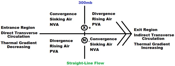
As air enters the jet streak, PGF becomes dominant, pulling it to the left, causing convergence in the left rear quadrant and divergence in the right rear quadrant. Once the air exits the jet streak, Coriolis becomes dominant, pulling the air to the right, causing convergence in the right front quadrant and divergence in the left front quadrant.


Please also note the Transverse Circulations of the entrance and exit regions. In the entrance, sinking air to the left and rising air to the right causes counterclockwise motion (as you are looking through the jet streak horizontally). This is the formation of the Low Level Jet, or LLJ. This is called a Direct Transverse Circulation because this particular circulation forces warm air to rise and cold air to sink. This also acts to weaken or destroy any thermal gradient in place. In the exit, rising air to the left and sinking air to the right causes clockwise motion (again, looking through the jet streak horizontally). This LLJ circulation is called an Indirect Transverse Circulation, because it forces cold air to rise and warm air to sink. This acts to create or enhance any existing thermal gradient.


Lastly, it should be noted that these Transverse Circulations and the way they create thermal gradients ahead of the jet streak and destroy thermal gradients behind it is what causes the movement of the jet streak itself, not wind advection.


Lastly, in straight-line flow, vorticity is created only by shear. Cyclonic shear to the left of the jet streak causes a vort. max. to form to the left; anticyclonic shear to the right causes a vort. min. to form to the right. PVA occurs ahead of the vort. max. because it is advecting FROM the area of maximum vorticity, and NVA occurs behind it because you are advecting TO the area of maximum vorticity, so it can only advect negatively onto the vort. max. NVA occurs ahead of the vort. min. because you are advecting FROM the area of minimum vorticity, and PVA occurs behind the vort. min. because you are advecting TO the area of minimum vorticity, and it can only be increased by any advections to it.


*I created this image.


FINAL STUDY GUIDE #4
This image is again a 300mb jet streak. The difference here is that it is cyclonically curved(NH). Cyclonic shear and cyclonic curvature combine to form a strong vort. max to the left, and anticyclonic curvature roughly negate one another, leaving you with no substantial area of vorticity, and subsequently no substantial vorticity advections to the right. There are also no substantial VV's on the right side.  Because of the strong Vort. Max. on the left side, strong PVA occurs ahead of the vort. max. and strong NVA occurs behind it.


*I created this image.


FINAL STUDY GUIDE #4
This image is a 300mb jet streak, once again. This jet streak is anticyclonically curved(NH). Anticyclonic shear and cyclonic curvature negate one another on the left, leaving you with no substantial area of vorticity, and subsequently no substantial vorticity advections to the right. There are also no substantial VV's on the left side.  Anticyclonic shear and anticyclonic curvature combine to form a strong vort. min. on the right side. Because of this, strong NVA occurs ahead of the vort. min. and strong PVA occurs behind it.


*I created this image.


FINAL STUDY GUIDE #4
This image is an 850mb jet streak. Please, PLEASE PLEASE PLEEEEEEEEASE be aware that a lower-level jet streak causes very different results in terms of VV's (vertical velocities). The convergence still occurs in the left rear and right front quadrants, and divergence still occurs in the right rear and left front quadrants. However, in the lower levels, convergence causes air to rise and divergence causes air to sink. Due to this, sinking air happens in the right rear and left front quadrants, and rising air happens in the left rear and right front quadrants.


*I created this image.


.BT

Geographic Temperature Variability, etc...

Okay, so let's get stuck right into it, then.  I love the weather, sky watching, forecasting (more like learning to right now...).  What I love ten times as much, though, is Geography.  Talking about it, teaching it, learning it.  I absolutely love looking at weather from a Geographic perspective.  Here is an example.  Here we will compare high temperatures forecast for Tuesday at 2 different times of the day.  There are several Geographic items I would like to address here.  First image is for 0500, the second is for 1700, 12 hours later.


0500 Local

1700 Local

First off, I would like to set the stage here.  Some things we should know are what, where, when.  We are looking at the Australian Continent.  It is located at the crossroads of the S Indian and S Pacific Oceans, which puts it in the S Hemisphere.  Typically temperatures get colder the further S you go, or we shall simply say henceforth "poleward", and vice versa for warm temperatures and N, or "equatorward".  When, well this is taken for 7 December, which means that down here we are right smack in the middle of Summer.  Also we shouldn't expect characteristic climatic conditions due to the La Niña sector of the ENSO (El Niño Southern Oscillation).  El Niño is characterized by predominately high surface pressure over Indonesia,  Malaysia, Polynesia, Australia, and the S Indian Ocean, and low surface pressure over N and S America, as well as a decrease in the trade winds, allowing 'backed up' warm water to flow E towards the Americas.  La Niña is the opposite.  The reasons for all of this are still unknown, though the object of stern scientific scrutiny.

Notice in the second image, forecast high temperatures for 1700 Local, the spatial distribution of the temperatures.  Notice all around Australia how zonal the temperature distribution is, almost parallel with latitude.  Have a look at where the hottest temperatures are ocurring; bulls-eyed almost dead center over mainland Australia.  This is due to the fact that land has a much lower specific heat than does water.  Water has one of the highest specific heats on earth, at roughly 1.81.  This means that land heats and cools much quicker than water does.  Out here in the Australian Outback, temperatures can easily break 35C, while plumetting to below 10C at night.  To change the temperature of a body of water with the surface area of Australia even 1C would take a catastrophic amount of energy; several times the power of a nuclear bomb.  It simply does not happen.  This oceanic or maritime effect acts to moderate temperature, as well as fuel storm systems with moisture in the summer months and moisture and relative heat in the winter months.

Compare this continentality effect of Australia with that of New Zealand.  Primarily two islands, New Zealand is moderated year-round by maritime influence.  Notice N of Australia, in the Tropics, the island of New Guinea (the Geographic island; the island itself is 2 countries, parts of Malaysia and Papua New Guinea).  People often times make the mistake of thinking that the hottest temperatures on earth are found along the Equator.  This isn't true.  Intense solar radiation from the sun strikes the Tropics (between roughly 23.5ͦN/S latitudes) and the hot air is forced to rise.  Once it rises, it diverges poleward in both directions.  At roughly 30N/S latitudes the air sinks, and diverges along the surface both poleward as well as equatorward.  This circulation between 30N/Equator and 30S/Equator is called the Hadley Cell, in both hemispheres.  This sinking air at roughly 30N/S latitudes causes the formation of deserts along these latitudes.  If you don't believe me, have a look at the image below.
The Equator runs through Northern S America, Central Africa (the green bit), and Malaysia, the group of islands N of Australia.  Notice the proximity of the desert areas to the Equator, roughly the same distance N and S of it.  The green is, in fact, vegetation, and this is due to the nature of the Tropics.  All that hot air rising causes condensation, clouds, and precipitation.  This causes a "belt" of clouds that pretty well encircles the earth almost any time of the year, which is called the ITCZ (Intertropical Convergence Zone).  This belt shifts N and S depending on the time of year.  Which is something else to note, is seasons.
Satellite imate of the ITCZ.
Typical proximity of the ITCZ which characterizes Tropical seasons, distinguising them between Wet and Dry.

A season is, by definition, a division of the year marked by changes in weather (temp., pressure, precip., etc.), daily hours of sunlight and ecology.  The Tropics do not know the traditional seasons so many of us are used to, Spring, Summer, Autumn, & Winter.  Rather Wet & Dry seasons, depending on the location of the ITCZ.  In the middle latitudes you find the greatest weather variations, and so you find Spring, Summer, Autumn, and Winter.  Other places have different seasonal classifications; for example, India has six distinct seasons.  Many areas around the Tibetan Plateau experence a monsoon season.  Then in the Polar regions the seasons are limited to simply Polar Day and Polar Night.
The first image from James Stewart's Calculus Early Transcendentals 5th edition, and is one of my favorites.  This graph plots hours of daily sunlight (Y-axis, dependent variable) as a function of time of the year (X-axis, independent variable).  Don't be too scared by the math, it's really simple, this one.  Notice the variability, that's what I'm really going for here.  Notice how close to uniform 20N is throughout the year.  To do this, follow the line for 20N from left to right.  The more "up and down" motion in the line, the more variability through the year of daily hours of sunlight.  Now compare this to 40N.  Now to 60N.  This is why higher latitudes (~60N/S -> 90N/S) experience seasons by Polar Day and Polar Night, because of the high degree of variability of daily hours of sunlight.  The middle latitudes are between the two, and moderate relative to the Tropics and Poles.

Back to New Guinea.  You notice that the forecast high temperatures are not as extreme as are those of Australia.  You can even see something opposite happening with regards to interior temperatures on New Guinea island.  The further inland you go, the lower the temperatures get.  Any idea why this might be?.  If you said it is because of mountainous regions, you would be correct.  This effect is called "orography", and it impacts both temperature as well as precipitation (or lack thereof).  You see this down in New Zealand as well along the Southern Alps especially.

Notice now the first image.  This is forecast temperatures for 0500 Local time.  Notice how zonal the temperature distribution continues to be, again except for Australia.  This is, again, due to the continental effect.  Notice Australia as well as New Zealand.  Many people make the assumption that this cooling is Antarctic air "creeping up" N, but hardly.  This is due to radiational cooling, which means that Australia will often times be cloudless on its interior, which means it radiates away most of the heat it gained during the day.  Not all of it, though; like a bank balance during the summer it is gaining more than it loses, thus heating up.  In New Zealand, the way the ocean keeps it from getting too hot, in the same way it keeps it from getting too cold.  During the day the land (outside of the mountainous regions) will tend to get hotter than the ocean, but at night it is opposite; the ocean you will often find is warmer than the land.  That's why during the day the ocean feels cool after standing on hot sand, but at night the ocean will feel warm after walking on the relatively cool sand.

There will be much more in the near future, this was just a bit of a primer, as well as setting the tone of this blog.  I hope you enjoy reading what I have to say and I always welcome feedback.

.BT